Pin It
Showing posts with label Graphic Design. Show all posts
20/02/2015
Great Graphic Inspiration #23
Lovely packaging for British luxury truffle creators Costello & Hellerstein by Robot Food. Created by hand, the ribbons of colour, produced by swirling ink over
water and overlaying cartridge paper, have come out incredible – I'm impressed and a bit jealous admitting that I'm always in lack of time in my own design processes and simply turns to the computer way to fast. Maybe it's time to take a deep breath and let the computer sleep, let the clients wait, and just have some pure, creative fun! Via Good Design makes Me Happy.
Pin It
Pin It
04/12/2014
I scream you scream we all scream for icecream
I know it ain't really season for icecream right now being winter and all, but I suddenly felt the urge when I stumbled over this exquisite icecream packaging for Gorky Park Icecreams by graphic designer Anastasia Genkina. Dazzling, bright colours and wonderful, clean pattern, and if the taste is just half as good as the design – I'm of to Moscow! Via Good Design Makes Me Happy.
Pin It
Pin It
06/10/2014
Carl Kleiner Compositions
Graphic compostitions with coloured paper as the raw material from the series There Will Be Blood by Swedish photographer Carl Kleiner. Simple and strong - just love it! Via Trendland.
Pin It
Pin It
22/09/2014
That time of the month ...
Not normally something I would celebrate, but when it comes to Le Parcel — a monthly
delivery service for “that time of the month”— it would probarbly change a bit. I love the concept with the little extra gifts and chocolates (yeah, I know I'm easy) and Seven Fifty Five did a fantastic job with the packaging, the logotype design and the lovely colour palette. And so good to know that Le Parcel is always there for me!! Via Good Design Makes Me Happy.
Pin It
Pin It
03/07/2014
Great Graphic Inspiration #22
Simple and strong branding for New York based photographer Ryan Slack, designed by Studio Newwork – also based in New York. The focus was on clean typographic design not too elegant with a simple colour palette: red on white to reflect vitality
and energy of the photographer himself. The red logotype fits in a thick
frame, and it gives a pop yet authentic impression. Nice work! Via Good Design makes Me Happy.
Pin It
Pin It
30/04/2014
Great Graphic Inspiration #21
Interesting and impressive is this Visual identity by graphic designer Duane Dalton for Imbue Furniture – a London based furniture company that specialises in bespoke and custom pieces to suit your every need. Imbue Furniture required an
elegant and memorable identity that communicated quality. The symbol
focuses on the joins present in the furniture and subtly represents the
multiple perspectives — a top down and side — that one can view or
interact with a piece of furniture. A custom logotype was drawn to match
the qualities in the symbol. Nice work Mr. Dalton! Via Good Design Makes Me Happy.
23/04/2014
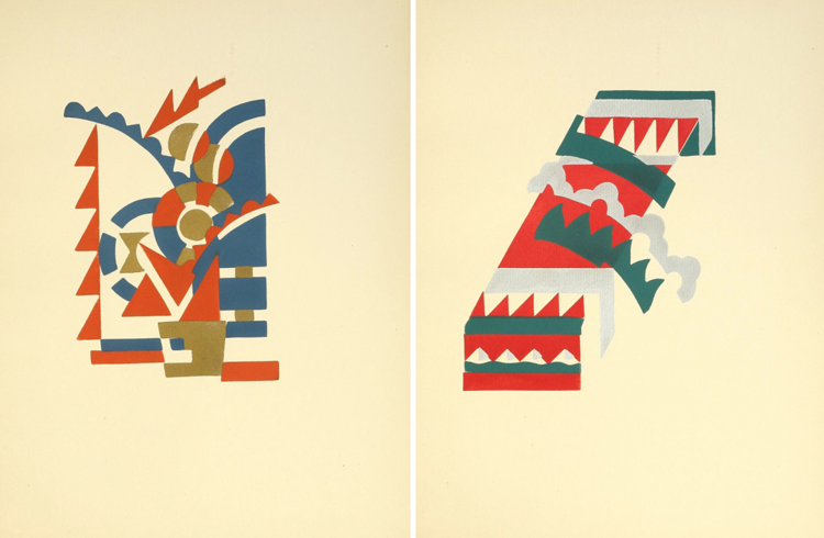
Fleurs from 1929
Fleurs: texte et vingt-six planches en couleurs (1929). That's the lovely no-bullshit-title of a book by Serge Gladky with – what I would call – a perfect collection of geometric forms and nice colours in playful combinations! Serge Gladky was a prominent figure in the Art Deco movement and a leading precursor of modern abstract art. Beeing a French architect, designer, and graphic artist, who
was active during the 1920s and 30s, he was primarily renowned for his
cubist style, and his decorative abstract prints were characterized by
the creative, harmonious synthesis of geometric forms derived mostly
from nature. Simple? Yes! Love it? Yes! Via Present and Correct.
Pin It
Pin It
Subscribe to:
Posts (Atom)